2012-03-23 03:18 - General

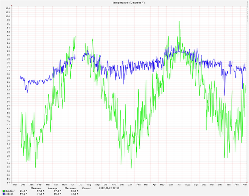
I've been running thermometers (indoor and outdoor) on the server I keep at home for a while now. It started as a way to control, like a thermostat, the heater and AC in my old apartment. Since, I've gotten used to having that data, describing exactly my situation. I originally kept a year of history, but wanted more. I managed to pull the old data file from backups, and merge all that history together into one file (10 years of history for now ...). Since New England has been setting temperature records recently, I figured it is an especially apt time to take a look at the graph.
Here I've got the tail end of 2009, all of 2010 and 2011, and 2012 to date. The year-long graphs come from averages of 4 hour windows, so the peaks aren't representative of real peaks then, but it does represent the mean temperature of the time.
The high peak for March 2010 was 60, just once, generally never over mid 50s. For 2011, one crazy high spike hit 67, then again generally low 50s. But 2012? It's been hanging out over 60 quite a lot.
P.S. The big gap in summer of 2010 is when I moved, so I didn't have the machine running.